Courthouse in ’s-Hertogenbosch

In 1992, Charles Vandenhove was commissioned by the Bouwmeester of the Netherlands to design the Courthouse in ‘s-Hertogenbosch. The challenge was to bring together on a single site all the services previously spread across seven different buildings and to replace the old infrastructure at the Spijnhuiswal, an early 20thth-century building which, whilst elegant, was no longer suited to the demands of the 20thth-century justice system. From the outset, the project has had to take into account the views of several stakeholders, notably the building’s owner, the Ministry of Justice, the future users and the city authorities, to develop a programme that brings together a court of appeal, a court of first instance and offices. The total floor area is 52,000 m2, making it what is set to be the largest courthouse in the Netherlands.

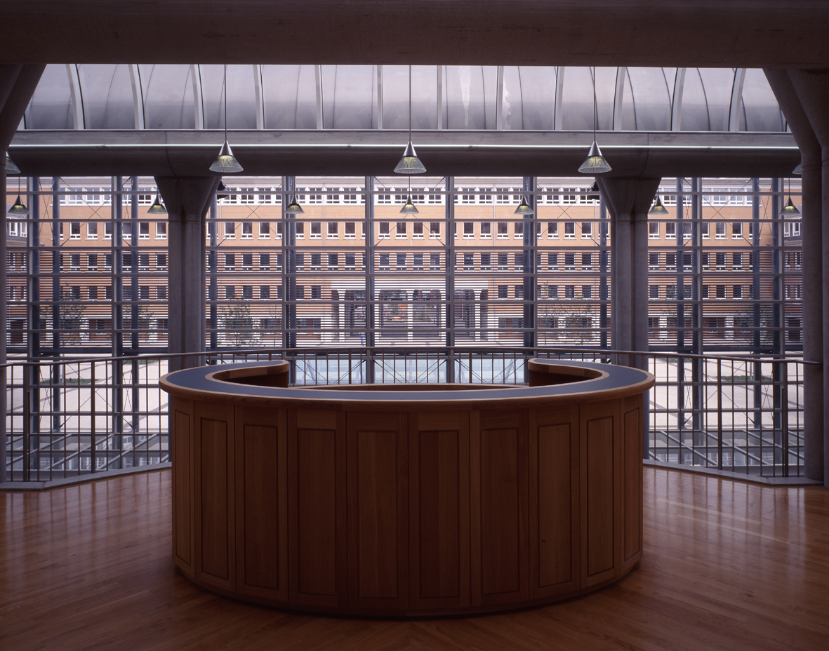
At the outset of the project, the authorities proposed an L-shaped plan to Vandenhove, in which the buildings were arranged around a vast esplanade opening onto the railway tracks. Vandenhove’s counter-proposal, which took greater account of the site’s constraints, was based on the cloister model and cleverly screened the complex from the railway traffic. Set on a vast rectangular site, the complex comprises four wings arranged around a large inner courtyard, beneath which lies a car park. Dominated by red brick, the façades of the four wings facing the city house offices and exude a monumental, almost austere presence. It is in the inner courtyard, however, that the essence of the design is revealed. It is here that the architect has situated the symbolic building, the one that epitomises the administration of justice. Vandenhove plays on a contrast in scale and materials by designing a long, glazed gallery that spans the full width of the courtyard and extends over two storeys. The ground floor houses 10 courtrooms reserved for the Court of First Instance, whilst the first floor is dedicated to the Court of Appeal’s courtrooms. A large lobby channels public traffic to the various premises, whilst separate routes are reserved for prisoners and the judiciary. A bold roof structure comprising a semi-circular glass canopy provides overhead lighting. The entire complex bears the Liège-based architect’s signature in various places, such as the architectural concrete columns that feature spectacularly in the gallery, or the two small pavilions – one circular, the other octagonal – in the inner courtyard.

But it is above all this new call to visual artists that helps to ‘humanise’ the exhibition as a whole. No fewer than nine different artists have been invited to collaborate. The contributions are varied and take the form of panelling, photographs or tapestries created by artists such as Marlène Dumas, Luc Tuymans, Henri Jacobs, Giulio Paolini and Jeff Wall.

Guest artists: Rob Birza, Jan Dibbets, Marlène Dumas, Ludger Gerdes, Henri Jacobs, Willem Oorebeek, Giulio Paolini, Luc Tuymans, Jeff Wall.
Poort van Breda

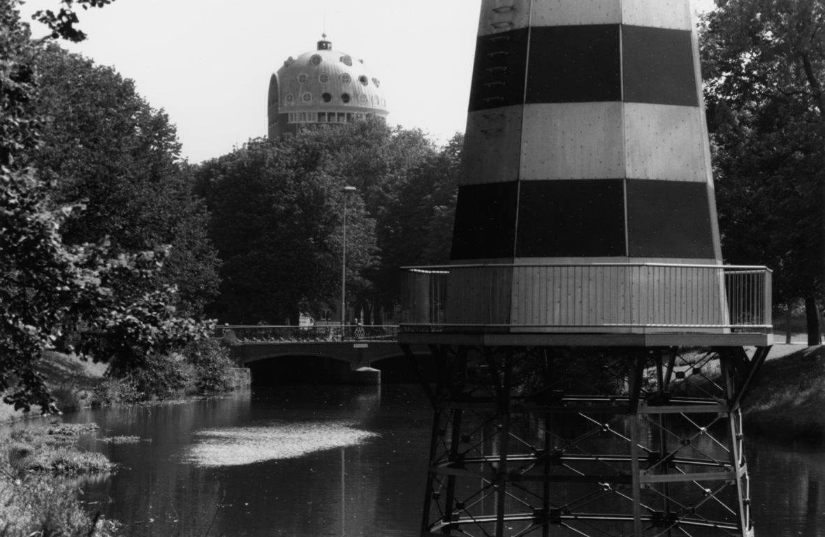
The early 1990s were a golden period for Charles Vandenhove, who was receiving a growing number of commissions from abroad, particularly in the Netherlands. After Amsterdam, The Hague and Maastricht, it was in Breda, not far from the Belgian border, that the Liège-born architect set up his drawing board. When he arrived in Breda, the architect was welcomed with open arms. A previous proposal had sparked an outcry… Vandenhove was received as the ‘urban planning problem-solver’, in the words of Prudent De Wispelaere. Although the project would face some difficulties due to several changes in the client, the planning progressed rapidly on the basis of a site plan drawn by Vandenhove on… a beer carton. The programme, which was fairly straightforward, combined 58 luxury flats and offices around a large courtyard above an underground car park. Once again, Vandenhove had a prime plot of land at his disposal, situated opposite the beautiful Valkenberg Park and a stone’s throw from the River Mark. On this generous plot, he played with volumes and building heights. Facing the park on J.F. Kennedy Avenue and benefiting from a significant setback, he opted for fairly tall buildings. True urban landmarks, the two towers – one with an almost circular plan, the other rectangular – flank a five-storey building. With its red-brick cladding and its dome pierced by oculus windows, the corner tower might bring to mind that of the Balloir, designed around the same time. But for Vandenhove, the references lie elsewhere and are far more local. On his arrival in Breda, the architect from Liège was impressed by the nearby domed prison. From this prison building, he adopted the principle of the zinc roofing as well as the shape of the arched lintels. On Sophiastraat, the complex continues with a four-storey building that blends seamlessly with the historic buildings. Whilst favouring brick and zinc in a highly understated style, Vandenhove nevertheless allows himself a few discreet formal touches, notably in the treatment of the plinth, whose concrete elements are marked by a succession of strigils – a motif of Etruscan and Roman origin that the architect is particularly fond of. The spacious inner courtyard has been given special attention, as evidenced by the paving with its herringbone patterns and the imposing bronze sundial created by José Bosard, a fellow student of Vandenhove’s and a renowned sundial maker in Wallonia.

Solferino Footbridge

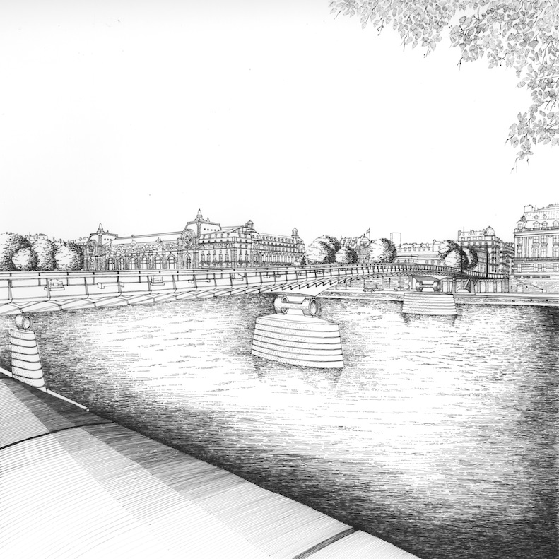
The project to build a new footbridge linking the Tuileries and Anatole France quays aims to provide pedestrians with a pleasant walk between two of the capital’s flagship institutions: the Louvre and the Musée d’Orsay. The new structure is to replace the ‘temporary’ bridge that had replaced the old Solferino Bridge, built under Napoleon III. This prestigious project is the subject of a design competition involving eight teams, including several leading figures in contemporary architecture such as Calatrava and Fuksas.

The project led by Vandenhove and his team – which includes visual artists Daniel Buren and the couple Anne and Patrick Poirier – aims first and foremost to establish a link with the very prominent historical and heritage context. Vandenhove’s proposal incorporates a consideration of the quality of public spaces that extends beyond the footbridge to the quays, infusing the area with the atmosphere of a promenade-cum-spectacle. For whilst both ends of the bridge form part of the continuity of the ‘upper’ quays, the challenge is also to ensure access to the lower quays, which serve as promenades for this Paris ‘rediscovering its river’. Vandenhove retains the old staircases built on the right bank under Napoleon III but adds, at each end, a staircase within the footbridge’s plane. On the left bank, the old abutment is rebuilt within the plane of the quay wall but is pierced to clear the view for walkers arriving from the Tuileries Garden.

The choice of materials reflects Vandenhove’s desire to ensure the structure blends modestly into the landscape. The abutments and piers are made of stone, whilst the deck of the 9-metre-wide footbridge is made of steel. Between the two, ball joints designed by the architect connect the piers to the deck.

True to his convictions, Vandenhove called upon several visual artists with whom he had previously worked. For the glass balustrades, Daniel Buren proposed engraving alternating thin stripes that echoed the pattern of the footbridge’s girders. As for Anne and Patrick Poirier’s proposal, it was based on the construction of three bronze obelisk-like spires: two on the Orsay side, and the third on the Tuileries side. The couple also envisaged, at each end of the footbridge, a row of wooden plinths displaying some remnants of the old bridge. The competition was ultimately won by the French engineer Marc Mimram, and the footbridge was officially opened in 1999.

Guest artists: Daniel Buren, Anne & Patrick Poirier.


Koninklijke Schouwburg

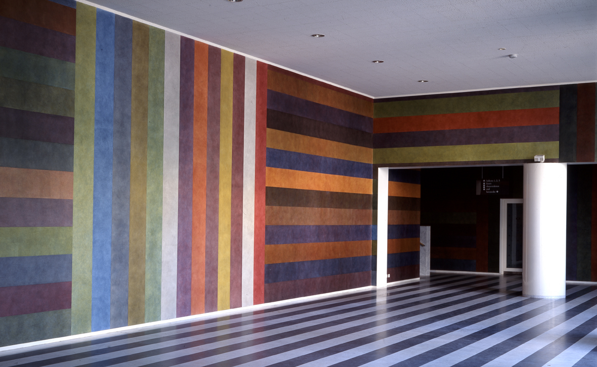
In the 1990s, Vandenhove had an extensive network in the Netherlands, particularly in The Hague. The expertise he had gained whilst designing the Théâtre des Abbesses and carrying out his ‘artistic’ intervention at the Théâtre de la Monnaie led to him being commissioned to renovate the Royal Theatre in The Hague, an elegant, classically inspired building dating back to the 18th century. Vandenhove’s project was carried out in two phases. The first, in 1991, involved the addition of a small building to the north-east wing. Entirely glazed, it was designed to house the new box office and a bookshop. However, the most significant intervention took place at the rear, with the complete renovation of the theatre and the demolition and reconstruction of the structure housing the stage (architects HH. Van Zeggeren, 1929). Designed in 1994, the five-storey building was intended to house offices, dressing rooms and technical facilities, but above all to extend the raised stage pit. The most spectacular change concerns the vertical circulation routes. On either side of the auditorium, glazed staircases comprising sandblasted glass steps provide access to the various levels. As in Brussels, Vandenhove once again called upon Sol LeWitt to bring his vision to the interior spaces. The American artist worked on all the walls of the foyer, creating large panels composed of horizontal or vertical bands in various colours. Jean-Pierre Pincemin was also commissioned to design the carpet patterns in the main auditorium and the sandblasted motifs on the glass balustrades in the offices.

Guest artists: Sol LeWitt, Jean-Pierre Pincemin.

Sea Trade Center

The construction of a passenger terminal in the outer harbour of Zeebrugge is a response by the Belgian port authorities and ferry companies (North Sea Ferries, Townsend Thoresen, etc.) to the announcement of the construction of the Channel Tunnel. As they will be unable to compete on journey time with the ‘Chunnel’, ferry companies are focusing on renewing their fleets. The ships are larger, but above all they are equipped with entertainment facilities (duty-free shops, cinemas, theatres, dance halls, etc.) to offer passengers a cruise-like atmosphere. The modernisation of infrastructure is also evident on land. In Zeebrugge, connections with Great Britain are part of the port’s history, and the local authorities are determined to maintain control over cross-Channel traffic by positioning themselves in competition with the ports of Calais, Dunkirk and Ostend.

In 1988, the Zeebouw Zeezand joint venture launched a major international competition for the construction of a building “that reflects the dynamism of the port’s activity, whilst evoking Bruges’ centuries-old history as a port, commercial and artistic centre”. The list of invited architects reflects the client’s ambition. It includes Tadao Ando, Santiago Calatrava, Norman Foster, Rem Koolhaas, Fumihiko Maki, Frank O’Gehry, Aldo Rossi, Bob Van Reeth and… Charles Vandenhove.

The building, designed to accommodate 3 million passengers a year, is divided into six main sections: a passenger area, an area reserved for lorry drivers, administrative offices, maintenance facilities, multi-purpose spaces – including conference and cinema rooms – and toilet facilities.

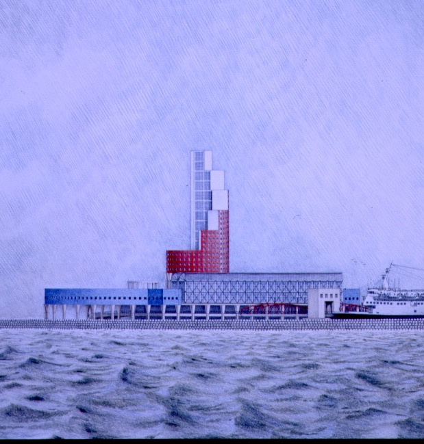
To meet the programme requirements, Vandenhove proposes constructing the building in the immediate vicinity of the ferry disembarkation decks. On Plan B, the structure rests on piles – ‘columns’, to use Vandenhove’s own terminology – which allow the ground-level spaces to be reserved for fast and efficient vehicular traffic. Above the base, accessible via spiral ramps, a vast covered car park accommodates vehicles. Above this, the second and third floors are reserved for passenger reception, as well as for the cinema and conference hall. The roof terrace is ideal for a stroll and is adorned with plants and water features.

The administrative and service areas, meanwhile, are situated higher up in a circular, stepped tower resting on columns. The architect’s design plays on a combination of colours – blue and red – whilst drawing on certain elements developed in previous projects, such as these two circular pavilions borrowed from parallel projects (De Liefde), which interact with the main tower.

Well received by critics, the project drew praise from Geert Bekaert: “Through its scale, its extreme attention to detail, its colour, the clarity of its composition, and the aristocratic distinction of its professional craftsmanship, this building stands on a par with the surrounding natural landscape as well as with the hustle and bustle of the port and the sea.” However, this competition ultimately appears to have been a purely rhetorical exercise. In the end, there will be no terminal of “high architectural value”, and passenger traffic at Zeebrugge will gradually decline before ceasing entirely in 2021.

Het Zieken

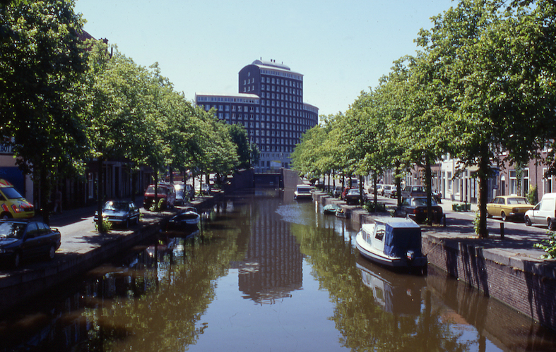
The construction of the Het Zieken complex came at a time when Charles Vandenhove’s practice was well established and had built a reputation in the field of social housing. The project was developed alongside other major commissions in the Netherlands, such as De Liefde in Amsterdam and Staarlokatie and Hoogfrankrijck in Maastricht. For this commission in the centre of The Hague, the architect had access to extensive plots of land on the former site of the city’s Public Works Department buildings. A pentagonal plot bounded by the Zieken and Groenewegje canals was to accommodate a complex comprising 222 dwellings spread across three main buildings. The tallest, crescent-shaped building stretches along the canals up to 13 storeys, thus emerging as a prominent landmark in The Hague’s urban landscape. To blend into the existing built environment, the architect has designed a building comprising 165 flats, the scale of which tapers in terraces. Dark brick dominates the complex, although architectural concrete with its diamond-shaped accents defines the lower storeys, whilst establishing the building within a design language that gradually distances itself from the historicist style reminiscent of the surrounding classically inspired buildings of the 18the and 19the centuries.

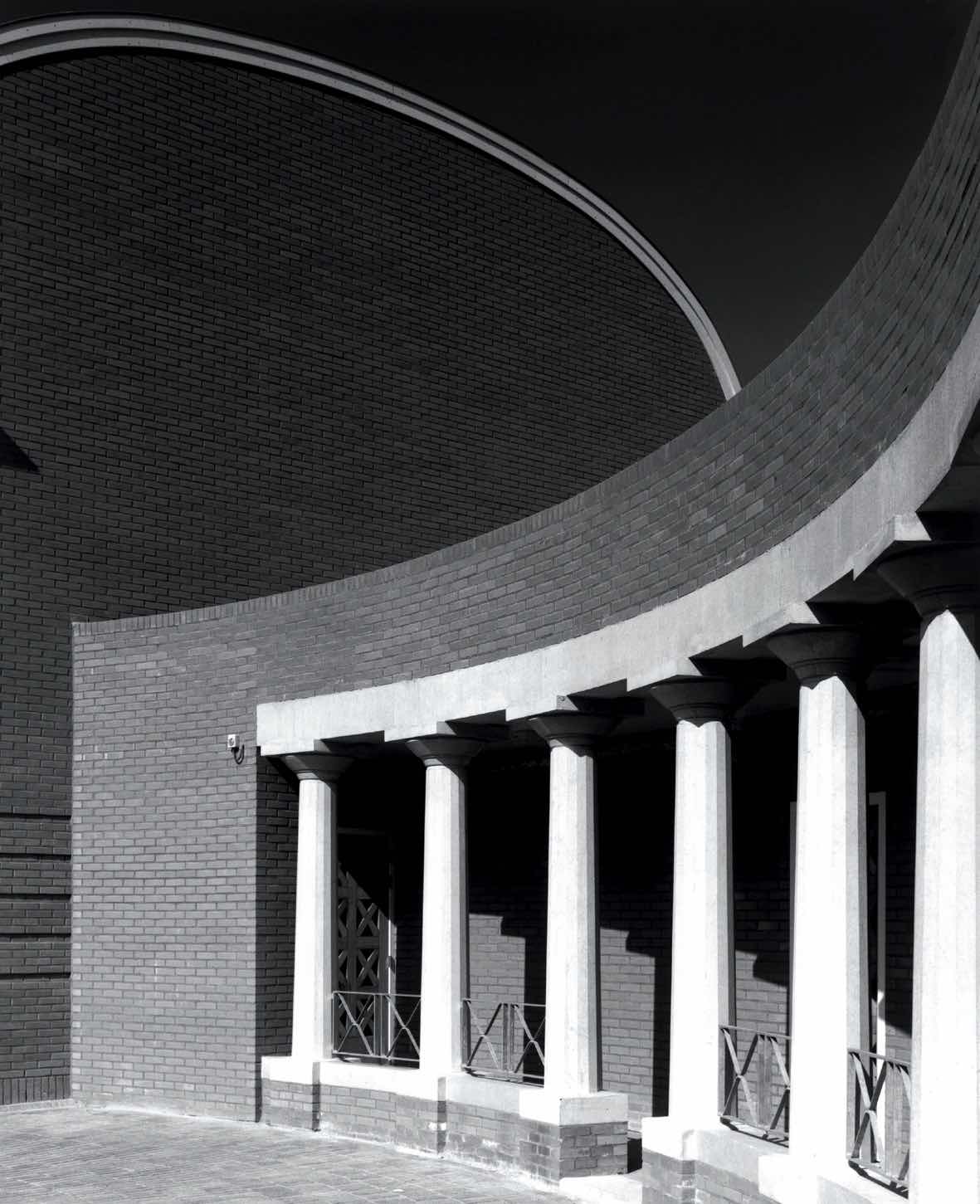
On the ground floor, the building features two small passageways providing access to the interior space and leading on to Huijgenspark. Upon entering the large inner courtyard, the atmosphere changes radically. Vandenhove has opted for more modest dimensions and a soft orange-coloured brick. After passing a four-storey, circular-plan pavilion reserved for a single dwelling, one reaches a second, elliptical-shaped building housing 36 terraced flats arranged over two storeys. These dwellings are accessed via individual doors situated beneath a colonnade that runs the entire length of the building’s perimeter. As in his other projects, the architect places great emphasis on the quality of the homes, and each unit features a lovely terrace facing the public inner courtyard as well as a private garden facing the outer edge of the ellipse. The public space at the centre, whilst somewhat more austere than in previous projects, is enhanced by two fountains, whose labyrinthine design, conceived by the architect, echoes the integration seen at Staarlokatie. Towards Huijgenspark, Vandenhove has designed twenty three-storey houses, each with its own street entrance and, most notably, a small garden terrace facing the private inner gardens.

Hoogfrankrijk

Run in parallel with the Staarlokatie project, the Hoogfrankrijk project is Vandenhove’s second project in the border town of Maastricht. Once again, it was the reputation Vandenhove had earned through his project in Hors Château, which had been completed three years earlier, that brought him to the banks of the Meuse. The project is situated in the former military quarter of Kat Hoog Frankrijk, within the current Staten district, on a spacious plot bounded by Capucijnenstraat, Hoogfrankrijkstraat and Herbenusstraat. Within a block interior primarily occupied by garage bays, the brief was to create 93 dwellings (public and private) in a densely populated area undergoing an urban regeneration scheme. As in the Hors Château project, the architect has employed a variety of housing types, combining terraced houses and apartment blocks, all organised around a spacious inner courtyard covering a large underground car park. The complex is accessible via three entrances on Hoogfrankrijk, Herbenusstraat and Capucijnenstraat. It is worth noting that the side entrances are marked by columns reminiscent of the entrances to the Cour Saint-Antoine in the Hors Château project. Each with its own small garden, the detached houses are spread over three storeys and are covered by a curved zinc roof. Red brick, a material characteristic of the region, is combined with architectural concrete elements that form the lintels and cornices. The highly symmetrical composition of the façades echoes the classical order evoked by the seven-storey apartment block with its pediment-shaped roof. Particular attention has been paid to the interior spaces. The main entrance opens onto a small square featuring a pyramidal sculpture designed by Charles Vandenhove, whilst in the centre of the main square a fountain, also designed by the architect, marks the path. The main entrance on Capucijnenstraat, meanwhile, features a work by Patrick Corillon. On either side of the corridor, the artist has arranged a composition of ceramic tiles – a nod to the local industrial heritage – with one depicting long jump records and the other high jump records.

De Liefde

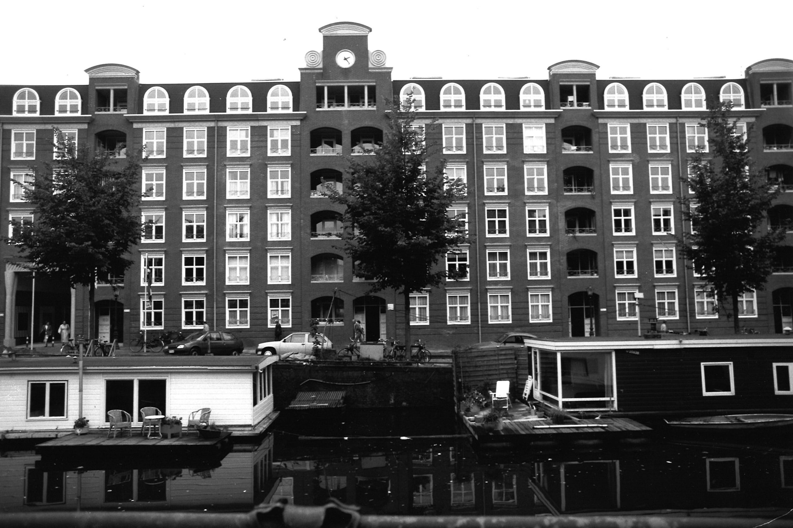
Now well established in the Netherlands, Charles Vandenhove’s architectural practice was receiving an increasing number of commissions across the Moerdijck. In 1992, the design for an ambitious social housing complex formed part of a wide-ranging regeneration programme for the Da Costa neighbourhood in Amsterdam, which had been underway since 1985. The project entrusted to Vandenhove is situated at the heart of a densely populated block, on a plot linking Bilderdijkstraat and Da Costa Quay, on the site of a school and the former ‘De Liefde’ church, from which the project takes its name. The trapezoidal shape of the site imposed certain constraints, which Vandenhove overcame by proposing two building blocks aligned with the road, set on a large slab beneath which 51 parking spaces are located. Inside the block, two wings connect to the main buildings and form an internal public space. This inner courtyard, at the centre of which stands a fountain surrounded by a ‘tholos’ designed by Vandenhove, is accessible via two covered porticoes, the walls of which feature artwork by Daniel Buren.

The logic of large-scale construction leads the architect and the client to propose a rational approach to housing. The layout is virtually identical across all 101 flats, where day and night areas are separated by circulation spaces. Standardisation, however, is not synonymous with a lack of quality, and Vandenhove succeeds in providing high-quality homes, notably by ensuring that each flat has its own terrace. The formal style adopted by the architect is part of a tried-and-tested architectural language. The historicist style, whilst not ostentatious, blends seamlessly into its surroundings. Admittedly, several architectural concrete elements bear the hallmarks of the Liège-born architect’s work, such as the columns framing the main entrances, the prominent lintels, or the imposing cornice that interacts with the long frieze composed of square motifs. These elements might seem out of place had the architect not taken care to develop an overall design language that fits perfectly into its surroundings. Both the building’s scale and the predominant material, brick, reflect local traditions. To align with the genius loci, Vandenhove even goes so far as to reinterpret the dormer windows that punctuate the neighbourhood’s façades. As for the clock crowning the street-facing façades, it emphasises the building’s public function whilst subtly evoking certain public buildings of the Amsterdam School from the interwar period.

Whilst housing forms the bulk of the project, Vandenhove proposed to the client that a chapel facing Quai Da Costa at the far end of the complex be built; this has now been converted into housing. Incorporating the flooring from the former church, it features a rectangular space painted entirely in white, in a style whose restraint is naturally dictated by the brief. The chapel also features the work of the American visual artist Robert Barry, with words placed here and there on the walls.

Guest artists: Robert Barry, Daniel Buren, Charles Vandenhove.

Staargebouw

Although the Hellevoetsluis project did not come to fruition, it nevertheless marked the start of a long-standing partnership between the Vandenhove practice and the Netherlands. In 1988, the City of Maastricht launched a competition for a major urban regeneration project in the historic centre near the Vrijthof, on the site of the Staarzaal. The experience and reputation gained through the Hors-Château project led the Liège-based firm to win the contract. Here too, the site is of great heritage value, situated opposite St John’s Church.

In a scheme combining housing, offices and public spaces, the architect opted for restraint and discretion; and, after several years of procrastination, the project finally came to fruition, confirming the refined approach of an architect who draws inspiration from the hallmarks of local architecture.

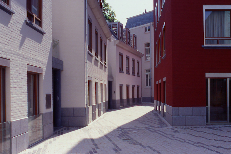
Near Hendrik Van Veldeke Square, Vandenhove is restoring a mid-18thth-century building in the Louis XV style, which he is converting into several flats. Opposite, the architect designed a building whose scale is in keeping with the neighbouring properties, not exceeding three storeys below the cornice, whilst incorporating white-painted brickwork on a plinth of small granite blocks. Embracing its contemporary design with metal-framed windows and afzelia sashes, it marks the entrance to a small street leading to a public space that extends towards Papenstraat. All around the new square, along the route towards the university (Papenstraat), Vandenhove proposes a variety of housing options. On one side, there are three-storey detached houses; on the other, small apartment blocks flank a seven-storey tower. Remarkably consistent in design, the tower features the same window frame design as the surrounding buildings, whilst showcasing Léon Wuidar’s work on the sandblasted glass balustrades. Clad in red-painted bricks, it seems to engage in a dialogue with St John’s Church. The interplay of volumes that Vandenhove favoured in his early projects (the Blood Transfusion Centre) is evident here, particularly in the cylindrical structure housing the stairwell and lift. Constructed from black bricks, it forms a link with the four-storey apartment block that closes off the square. As in the Hors-Château project, Vandenhove enhances the public space with sculptural elements. Jean-Pierre Pincemin plays on the shades of the paving stones to create an abstract pattern on the ground, whilst Charles Vandenhove completes the ensemble with a stone table-fountain and a set of four small granite stelae with gilded capitals.

Guest artists: Jean-Pierre Pincemin, Charles Vandenhove, Léon Wuidar.

Le Balloir

The Balloir project bears witness to the close ties between Charles Vandenhove and La Maison heureuse, for whom the architect had designed the head office in Ans a few years earlier. It also bears witness to the commitment of Father Gerratz, founder of La Maison heureuse, whose life is entirely devoted to helping the destitute. As with the Hors-Château and Torrentius projects, this involves working on a complex of great historical value formerly occupied by the Sainte-Barbe hospice, some of whose buildings date back to the 17thth century. This ambitious project combines the restoration of the historic buildings with new constructions to house a crèche, a care home, a children’s shelter, a sewing workshop, a second-hand clothes shop, as well as several community spaces and administrative offices. The development of a public space opening onto Place Sainte-Barbe is also part of the brief.

Housing administrative offices, guest rooms and several communal areas, the historic buildings are undergoing a meticulous refurbishment, the design of which reinterprets local tradition. The solutions devised by Vandenhove for the Torrentius and Hors-Château projects are thus evident, in particular, in the treatment of the window frames and certain lintels. We also see certain elements that the architect had developed in the Schunk pharmacy, such as the architrave engraved with abstract motifs or the lobed column. The building facing the Meuse has been extended by a concrete volume at the rear and raised by one storey to house the refectory, whose vaulted ceiling features a work by Jean-Pierre Pincemin. To this architecture rooted in history, Vandenhove adds two buildings with a distinctly contemporary design. Facing the Meuse and opposite the Protestant church, an octagonal tower houses apartments for the care home and is crowned by a dome, whilst at its base, a nursery shaped like flower petals opens out onto the garden.

On the other side, towards Rue Gravioule, the architect has situated the caretaker’s flat and the second-hand shop in a small building whose exposed concrete stands out from the rest of the development. In the centre, shared green spaces encourage people of all ages to come together. The unique and generous vision of Le Balloir continued a few years later with the construction of a new block designed to house rooms for the care home. Connected by a glass walkway, the building adopts a distinctly different style through the use of red concrete coloured throughout the mass. Here too, art and residents coexist, with the enamelled sheet metal panelling in particular featuring designs by Patrick Corillon, Robert Combas and Loïc Le Groumellec.

Guest artists: Robert Combas, Patrick Corillon, Loïc Le Groumellec, Jean-Pierre Pincemin, Léon Wuidar.